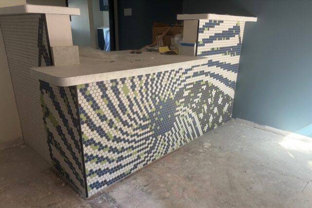

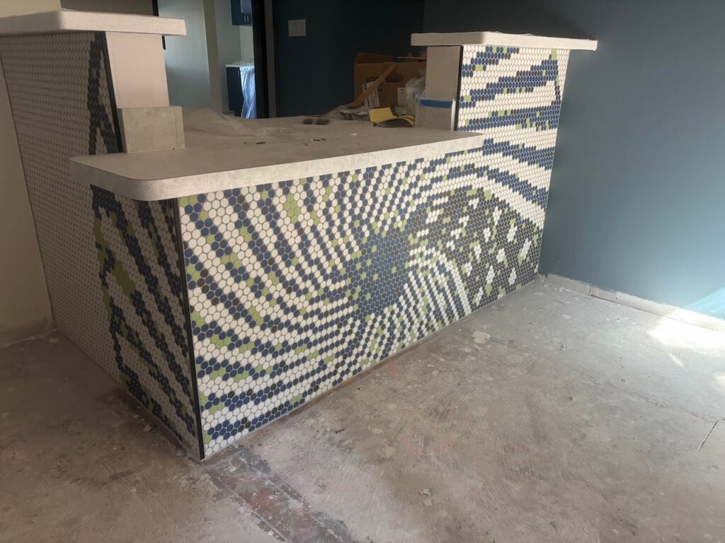
Here is a behind-the-scenes look at the tile design for the new front desk of McFarlane Dental’s new digs.
This design stems from a series of design elements of our logo. The logo iterations started as a color logo, with red, green, blue. After using this colorful logo for a few years, I needed a logo that could be used to etch a plaque, and therefore, only black-and-white. So, I modified the stripes, from their colorful origins to a design with hash marks where the color change goes. The beauty of choosing a round logo that can still fit nicely in a square box is that you can rotate the design as needed to suit various situations.
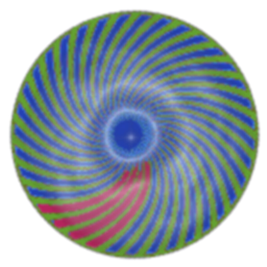
This logo was a response to the world of dental logos, which almost exclusively include a tooth. By the time I made that logo, in 2014, it was a response to the market that is completely flooded with dental logos featuring teeth. I think it is a mistake for all the dental logos to feature teeth, because it sends the message that we treat teeth, instead of treating patients.
When it was time to etch the logo on a plaque, I realized that I wanted a simpler way to convey what the color version conveyed, so I reworked the logo into the black-and-white version.
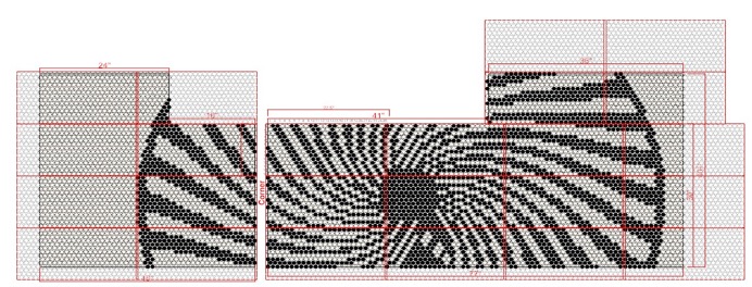
So, here is the initial tile design that the builder/tile design team [Daltile Custom Keystone] sent back. While it is true to the updated logo, the interesting part was trapped at the bottom where it is essentially invisible. So, it was time to take advantage of the fact that it can be rotated.
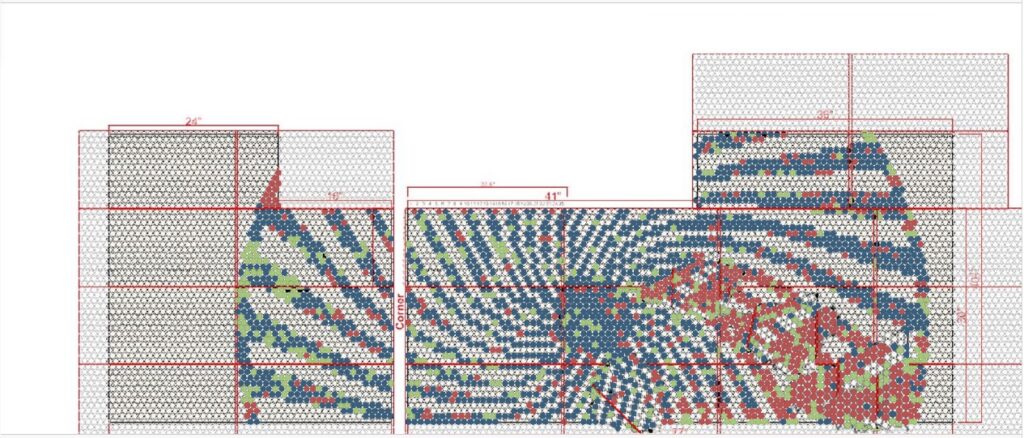
So, I did a screen grab of the B/W version, and put it into Photoshop and painstakingly changed the colors of every dot to create something with a little more intrigue. Adding some color back in also hearkens back to the original design. Effectively, making this tile mock-up a nod to the past, present, and future. But, alas when they got back to me they explained that we could not use the red tiles, because they are not available in that size and therefore cannot be used in these types of custom designs.
Here is the sped-up version of what that looks like.
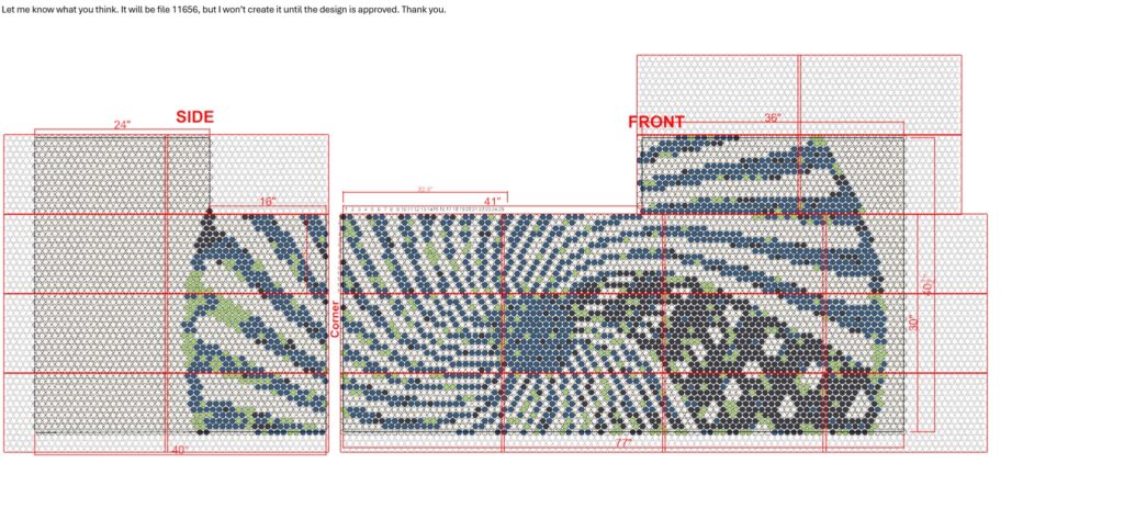
This screen grab shows the final mock-up. You can see that the blue is fairly dark, and the black is a muted black, so they blend together, and there is only mild contrast between them. But, it is just enough variation to keep it interesting.
I would say the final product is pretty true to form. Good job Daltile.
Looks so good!
Looks so good!👍